Who’s on 1st

In QlikView/Sense one of the things that comes up periodically is rank. I have seen a number of posts where people have asked about appending a suffix to a number to indicate where you are positioned.

1st, 2nd, 3rd, 4th and so on. There are a couple of excellent posts on the community site giving a solution for a calendar, but what if you want more than 30? I embarked on creating a simple function that could be easily reused. I was also inspired by Steve Dark’s blog post about using formulas to create functions. If you missed it – you can find it here: Quick Intelligence Post.

This combines a couple of operations:

Match – for catching the special cases

Mod – to limit the number of cases

Pick – to do the selection.

You really only care about the last digit, so Pick is perfect for that. You just need to offset things by 1 in order to handle zero. Since this is a formula and you are going to pass in a value when you use it – $1 will represent the number.

Pick(Right($1,1), ‘th’, ‘st’, ‘nd’, ‘rd’, ‘th’, ‘th’, ‘th’, ‘th’, ‘th’, ‘th’, ‘th’)

The problem is the special cases. 1st is good, but 11st makes no sense. The exceptions are anything that ends in 11/12/13. This comes up in any multiple of 100, so the way I addressed that is to strip off anything over two digits using Mod() (Short for Modulus). This returns the remainder of dividing by the value provided, so 101 becomes 1, 2414 becomes 14.

This makes the final expression:

set vNumberSuffix = If(Match(Mod($1,100), 11, 12, 13), ‘th’, Pick(Num(Right($1,1), ‘#’)+1, ‘th’, ‘st’, ‘nd’, ‘rd’, ‘th’, ‘th’, ‘th’, ‘th’, ‘th’, ‘th’));

This expression is part of a load script, so I used SET to initialize the string but not evaluate it.

You can also set it up in the Variable editor if you are so inclined.

When you use this in an expression it becomes $(vNumberSuffix(numbervalue)), where numbervalue is your numeric field or formula.

Loading data from QVDs with different structures

QVD files are a great way of dealing with archive data. The problem you can run into is that over time, the fields that you capture in your archive may change. Typically you wind up expanding the number of fields, which was the case I had to deal with.

I did some searches and found some interesting approaches, but I will add my own variant.

Here are the high level steps:

1. Create a header record containing all of the fields you care about, with some initial value. I also like to take one of the keys, and put the letter x in it so I can filter out the header later on.

2. Concatenate load all of the QVDs. Since all of the fields exist, you do not run into any problems with fields getting ignored.

3. Load resident from your temporary table while excluding the record key = x [Optional]

One of the best ways to get started is to open the QVD that contains all of your fields, or at least most of them using a QVD viewer. I like EasyQlik viewer Use the feature to generate a load statement. Make sure you open the one with the most data fields.

It will look something like this:


LOAD
Field1,
Field2,
Field3,
Field4,
Field5,
Field6,
SnapshotDate
FROM [myQVDFileName] (qvd);

Now you want to convert this into a record load and give it a name – this will be our header record

tmpArchives:
LOAD
'x' as Field1,
'' as Field2,
'' as Field3,
'' as Field4,
'' as Field5,
'' as Field6,
'' as SnapshotDate
Autogenerate 1;

If you have any additional fields you need, just add them to the load above with some kind of value, or just a null string. This establishes the base structure of your table – so no fields will be ignored.

Now you can loop through your QVD files and concatenate them each in turn without fear of losing any fields.

After your loop, you can pull it into your final table and drop the original.


Archives:
Load * resident tmpArchives
where Field1 <> 'x';

Drop Table tmpArchives;

This drops out your dummy header record and clears out the temp table.

ws

QlikView strings – an adventure in parsing email

Here is the background – I was working on a dashboard on top of a trouble ticket system and we wanted to look at open tickets/cases and determine the last time somebody contacted the customer.

Most of it is straight forward with the exception of the CRM’s ability to have users drag and drop emails into the system, where the contents of the email are saved as text in the notes for whatever trouble ticket it was dropped on.

The problem is that although you know who dropped it in, you don’t know who sent the email, or who it was sent to.

So, having only the raw text of the email, how do you determine if it was an outbound communication to the customer that it was logged against?

(I’ll warn you in advance – this is a long post.)

So – i figure if it came FROM our domain and went TO the customers DOMAIN – then it was outbound. Simple. Sounded like a winner. So the first order of business is to figure out where the different pieces of the email start and more difficult, where they end. Although FROM: is always at the beginning, how do you find the end of the TO: field? It could either be ended by a CC:, a BCC:, or Subject:

And YES, there were a few more twists – but let’s just stick to the basics for now.

So – how do you parse out who it was to? – assuming a table called email_Hist, and field called WORKINGNOTES I did the following:

<code>
Left Join (email_Hist)
LOAD
EventDetailsID,
Replace(Replace(Replace(Replace(Replace(Replace(Replace(WORKINGNOTES, ‘FROM : ‘, ‘|F|’), ‘TO :’, ‘|T|’), ‘CC :’, ‘|C|’), ‘BCC :’, ‘|B|’), Chr(13), ‘~’), Chr(10), ”) , ‘Subject:’, ‘|S|’)
as delimNotes
Resident email_Hist
;
</code>

What this does is change each of the headings of From / To / etc into a standard format delimited by the pipe character, both front and back. The replace operation above can be a bit hard to read only because it is nested through seven replace operations. I also flatten out anything with carriage returns by replace those with tildes. The reason for the pipe characters is to create “book ends” where I can use the TextBetween and not have to worry about what the next field is. This looks like this:

<code>
Left Join (email_Hist)
LOAD EventDetailsID,
Replace(TextBetween(dLimNOTES, ‘|F|’, ‘|’), ‘~’, ”)) as fromName,
Replace(TextBetween(dLimNOTES, ‘|T|’, ‘|’), ‘~’, ”) as ToNames
resident email_Hist;
</code>

The beauty of this is that now that I have my own delimiters in place – I don’t care what the next field is anymore because I know it starts with a pipe.

Next hurdle – domain match.

In order to use what we have so far to do the outbound domain match you need to have the domain(s) handy. This is turned out to be more complex than I had anticipated because not all company email addresses match the URL of their website. I decided nothing works as well as brute force so for each contact at an account, I stripped the email domain from the address and turned that into a mask to match against.

I started with a raw list of domains, and then turn them into a single string

<code>

AccountDomains:
SQL
SELECT DISTINCT ACCOUNTID, SUBSTRING(EMAIL, PATINDEX(‘%@%’, EMAIL)+1, LEN(EMAIL)-PATINDEX(‘%@%’, EMAIL)) EDOMAIN
FROM CONTACT
WHERE EMAIL LIKE ‘%@%’
;

DomainList:
LOAD ACCOUNTID, ‘*’ & Concat(EDOMAIN, ‘*,*’) & ‘*’ AS DomainMatchList
Resident AccountDomains Group by ACCOUNTID
;

DROP Table AccountDomains;

Left Join (email_Hist)
LOAD ACCOUNTID, DomainMatchList
Resident DomainList;

DROP Table DomainList;

</code>

The idea behind this is that I only care about what comes after the @ sign. I am actually being generous here with my tech support folks because I am saying that if you emailed anybody at the company – I’ll give you credit as an outbound. The DomainList table results in a single entry per account with the DomainMatchList field ready to use with a Wildmatch string operation, since it creates a string that might look like this ‘*domain*’, ‘*domain2*’, ‘*domain3*’
(Yes – I realize I cheated and did some of the string work directly in the SQL, but it was fast and easy to test)

The email_Hist table has a few more fields such as the contact’s last name, email address, alternate contacts last name and email. So taking all the pieces and combining them..

<code>
Left Join (TicketActivity)
LOAD
EventDetailsID,
if(WildMatch(ToNames, ‘*’&ContactLastName&’*’, ‘*’&ContactEmail&’*’, ‘*’&AltContactLastName&’*’, ‘*’&AltContactEmail&’*’)>0 OR WildMatch(ToNames, DomainMatchList) > 0, ‘Yes’, ‘No’) as ToCustomer,
if(WildMatch(fromName, ‘*@ourdomain.com*’, ‘*ourAlternateDomain*’) > 0, ‘Yes’, ‘No’) as isFromUs,
if(WildMatch(fromName, ‘*’&UserLastName&’*’) > 0, ‘Yes’, ‘No’) as isFromUser
Resident email_Hist;
</code>

There is some more processing that goes on and then email_Hist gets dropped.

The logic is very generous for giving credit – i.e. if you sent it to the company and/or either of the ticket/case contacts – it counts.

A few notes before the criticism starts.

1. This processing is limited to Open tickets, which cuts down on the data volumes dramatically.

2. The code shown here is optimized for clarity, not performance.

3. I am using wildmatch() > 0 here really just to detect whether what/who i am looking for is in the mix. TO: addresses often have numerous recipients, and I decided NOT to separate those out and look for exact matches. You could certainly use this as the starting point to make it more restrictive.

Hope you find this useful

ws
Controlling # Months displayed in Year over Year Charts

A common request is to display year over year comparisons, and there are a number of ways of accomplishing that.

What if your users do not want to see any of the future months, or even possibly this month, since it is not yet complete?

This actually turns out to be fairly easy – you just need a few pieces to make it happen.

Here are the components

  1. a Variable to hold the # of months to display
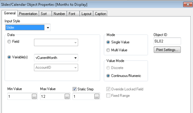
  2. Something on the screen that lets the end user control things – I used a slider in this case.
  3. a calculated dimension in your chart.

Step 1 – create a variable. (Settings / Variable Overview / Add). I called mine vCurrentMonth, and set it in the load script to be whatever the current month is based on today’s date.

let vCurrentMonth = Month(Today());

Step 2 – set up your slider control

Image

I also put a Caption/Title and a border on it. It winds up looking like this:

Image

3. The chart dimension

I load a master calendar where I have values set for every date as to MonthOnly, ReportingMonth, Year, and a variety of other flags.

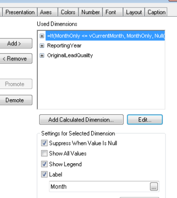
In my chart – I use that in the first dimension

Image

Things to note – I specify a label, and check “Suppress when Value is Null”

and expanded view of the dimension

Image

The reporting year dimension is exposed to the user as a list box, so they can display the year(s) of interest.

The one issue that people may have will come down to preference – this will fill the chart with the number of months that it needs to display. If you want to show the subsequent months as blank spaces, you will probably want to implement this via set analysis in the expression instead of a calculated dimension.

ws

Creating a QlikView Pivot chart with User Selectable dimensions

Pivot tables in QlikView are great.

Sometimes though, you want to enable users to change the dimensions of the pivot without having make changes to the Chart.

One way to this would be to have 6 different charts that they could choose from and use the auto-minimize feature on the charts to manage the displays. It just seemed to be too much to maintain, so I found an alternative.

The issues to solve are:

1. Do not display the chart unless all three dimensions are selected

2. An item can only be selected for one dimension.

3. The display names for the dimension headings are different from the underlying Field Names

I’m going to tackle item 2 first… an item can be used only once. Nothing really elegant about that as it turns out – it is simply an inline table with three columns called Field1, Field2, Field3. Create a line for each of the combinations you want to allow, so you will have 6 lines total. If you were to look at them as numbers, then the combinations would be 1,2,3 and 1,3,2 and 2, 1, 3 and 2, 3, 1 and 3, 1, 2 and 3, 2, 1. In my case it looked like this:

Dimensions:
LOAD * INLINE [
Field1, Field2, Field3
OriginalMarketingStatus, MediaType, RequestType
OriginalMarketingStatus, RequestType, MediaType
MediaType, OriginalMarketingStatus, RequestType
MediaType, RequestType, OriginalMarketingStatus
RequestType, MediaType, OriginalMarketingStatus
RequestType, OriginalMarketingStatus, MediaType
];

To enable the user to make their selections, I used a MultiBox with Dimension1, Dimension2, Dimension3 as the available fields. Of course you can substitute individual list boxes if you prefer.

Next up – I want to translate the dimensions into headings. This is another inline table / data island. In mine, I wanted to pretty things up and shorten one to an code, so it looked like this

DimensionLabels:
LOAD * INLINE [
FieldName, DisplayName
OriginalMarketingStatus, OMS
MediaType, Media Type
RequestType, Request Type
];

The next piece you need is to have variables for your dimensions – I just called them D1, D2, and D3 and set up formulas to set their values.
D1 = GetFieldSelections(Field1), D2=GetFieldSelections(Field2),  D3=GetFieldSelections(Field3)

Now for the pivot table

For your dimensions, use $(D1), $(D2), and $(D3)

For labels, use the calculation  =FieldValue(‘DisplayName’, FieldIndex(‘FieldName’, D1) )
Repeat for D2, D3

This uses the Dimension Labels table as a dictionary by finding the correct row using the field name, and then referencing the corresponding value.

And of course – the final requirement – only show it when its ready.

Navigate to the layout tab and set it to show conditionally on the condition below – which is to select one field from each of the three dimension choices.

= (GetSelectedCount(Field1) = 1) & (GetSelectedCount(Field2) = 1) & (GetSelectedCount(Field3) = 1)

In mine, I added one more touch – and that is a dynamic window title.

= ‘By ‘ & FieldValue(‘DisplayName’, FieldIndex(‘FieldName’, D1) ) & ‘, ‘ & FieldValue(‘DisplayName’, FieldIndex(‘FieldName’, D2))  & ‘, ‘ & FieldValue(‘DisplayName’, FieldIndex(‘FieldName’, D3) )

The overall effect is very cool, and as a developer – means only having to maintain one chart instead of 6.

It takes a little bit of playing around with it to get everything just right… but it is worth it. You will probably also want to have a text object on the bottom layer where the chart should display to communicate with the user that they need to select all the dimensions to show the chart.

ws

Bad data – why not highlight it?

One of the issue you always run into when building dashboards is that you run into combinations of data that should not exist, but they do.

This presents a limited set of options in terms of how you deal with it.

You could just compensate for it using things like maps where you just automatically lump it into that category called “other”.

You could just automatically correct the known issues, then maybe lump the rest into other as above. The problem you run into when you automatically correct things is that it can make reconciling your dashboard to the data incredibly difficult.

How about a third approach? Why not just highlight that there is something that looks “wrong” about it. As you are loading it in, you can trap the conditions that you know are not supposed to happen, and then you can create a “problem” table in your load – so that for each problem you have – a record key to tie things back in properly, and a text explanation of why this is an issue.

After all – isn’t one of the key issues always whether the data in your dashboard can be trusted?

It’s a bit of an attitude shift in terms of what you are displaying in your dashboard. Part of it depends on who your audience is. I have a client that is obsessed with data quality, and for good reason. They have used their dashboards to dramatically improve their bottom line. If there are problems with the data, they will go fix them. If you have ever tried to track down those bad entries, you know how difficult a process this can be.

By highlighting known data issues, you effectively take them off the table when it comes to validating results. Anything that is compensated for, or simply hidden or ignored in a data load is going to make your reconciliation process difficult, if not impossible.

Hmm… now that I think about it, maybe all I am saying here is that as much as QlikView dashboards help bring transparency to your business application, that you should also apply that concept to the dashboard itself – use it to show off where there may be doubts about any of the information – warts and all.

After all, if you can see the wart, you always have the choice to remove it.

Cherry Picking Excel data for QlikView

I was recently asked to see if I could pull a couple of values from an Excel Sheet and incorporate it into a dashboard. The problem is that the sheet was never designed to be used in that way. There are some great tools out there for parsing Excel sheets like Monarch, but I really only needed 4 cells.
Just to keep things interesting, the cells are basically in random locations and contain some totals for Sales Work in Process data so the cell location is almost guaranteed to change over time.

So here is what I came up with

Step 1

Assign Cell Names to the data points you care about.

Step 2

Create a new tab within the Worksheet and rename it so you can find it later. I called mine Summary.

Step 3

Create a column heading for each of your values, and put a cell reference in the cell below it. If you named your cell “Total1” in step 1, the reference is simply =Total1

Step 4

Hide your tab and save your work.

Step 5

Open your Excel file from QlikView using the table wizard. Each of the tabs in the worksheet is in the drop down list marked Tables. Select Summary$ (or whatever you named yours), and your values will appear as nicely formatted QlikView usable data.

Notes:

  • I like using named cells since they are much harder for the Excel Users to break. Since they are all total fields, they are not likely to delete them, and as they add and delete rows, the name will remain intact.
  • I hid the tab just to avoid having somebody decide to “tidy up” the worksheet and get rid of something that looks so trivial. Fortunately QlikView does not care whether the tab is hidden or not – you can still read from it.
  • Although I used the named cells just for individual values, you can also you names for ranges, so it could possibly be expanded to do even more sophisticated things. My needs were pretty simple, so I did not experiment with those.

ws

QlikVIew Table displaying Top N with correct totals

Using a straight table to display the top N of anything is pretty straight forward. Create the dimensions, add the expression you care about, sort by it and limit the display to your 5/10/etc number of accounts. A couple of minutes and you are done.

Totals? Check.

Well… not so fast.

It turns out that QlikView will display the total for all items, not just the ones that are being displayed. I kept looking for a “Sum only displayed values” check box, but could not find it anywhere. Sounds like a great wishlist item.

So now the adventure begins…
I read through everything I could find on community, and still could not get there.

Here is the key.
You need to push the top N selection criteria into a calculated dimension. This way the entire data set will only consist of the rows that you want totaled. Sounds easy, turns out not to be quite so straightforward.

I was trying to show things like “Top 10 Opportunities closing within the next 30 days”

So… here are the components

1. First you have to limit the records to the ones that you care about. Do a conditional sum based on your selection criteria like Status = ‘Open’ and DaysUntilClose less than or equal to 30. (Note: DaysUntilClose is calculated as part of the load script).

2. Now rank them by SalesPotential

3. Use the Aggr function to apply it back to the Opportunity Identifier.

4. Stuff this all into your calculated dimension

5. Do NOT limit the display

6. Set the expression total to be sum of rows

So if I want to get the top 10 Opportunities based on Sales Potential that are closing in the next 30 days – the calculated dimension would look like this:


=IF (AGGR(RANK( SUM(IF(STATUS='Open' AND DaysUntilClose <= 30, SalesPotential)) ,0) , OpportunityId )<= 10 , Opportunity.Description )

Remember to turn off display of Null values.

More on the Ranking Mode. The code above uses Mode = 0, which is the default.
Using this, you may wind up with more than 10 records. This is because Mode 0 effectively says “Is in the top 10 values”. So if you do a top 10 values, then ANYTHING that matches those top 10 values is included. Think in terms of a race – if you have a 5 way tie for third place, then your top 3 would actually be 7 racers.

Mode 4 will return just the number of records you asked for, but some of the records that match the lowest value will be arbitrarily excluded.

Pick your poison on that issue.

There you go – that wasn’t so bad after all…

Qlikview stack/group the bar chart with a macro

Bar charts are one of the easiest way for people to see information. When you have a second dimension, whether the chart makes more sense as a stacked bar, or grouped bars often depends on how far you have drilled in to the data. If there are too many active items, the grouped bars become hard to interpret.

Since screen real estate is always limited, if you could just toggle back and forth between a stacked chart and a grouped one it would make life simpler. It turns out that it is pretty easy to create a macro that just flips that attribute.

In this example the chart object is CH354


Sub ToggleChartBarStack
dim chart
dim cp
set chart = ActiveDocument.GetSheetObject("CH354")
set cp = chart.GetProperties
If cp.ChartProperties.BarModeStacked = true then
cp.ChartProperties.BarModeStacked = false
else
cp.ChartProperties.BarModeStacked = true
end if
chart.SetProperties cp
end sub

This could obviously be more general than this – this only works on the one chart. Maybe that will be a future post – where I generalize it and play naming games with the button and the chart.

hope this is useful

ws

Dumbing down your SQL

I’m seeing a theme.
Typically it starts with an email from a tech person who has hit the wall in working with QlikView. The problem seems to be that they were able to do a fair amount with QlikView and are seeing the dramatic results, but need to take that next step and . . . they don’t know how to get it there.

The QlikView environment is a double-edged sword since it does not force you to work in any particular fashion. You can put together some truly amazing things, or construct something that really just is not going to do what you want it to do with equal ease.

Where most people start to run into trouble is when they are really good on the database side and can wrestle the data into a nice simple form to load it into QlikView. I’ve seen some really interesting uses of SQL Views, multiple table joins and even stored procedures created just because it was a quick and dirty alternative to having to learn any of the QlikView ETL script.

Here is where it is going to break down on you:

1. SQL views will often take away your ability to use incremental loads if they are not indexed – as many are not. I suppose you can still try to do incremental loads, but SQL is going to be doing a table scan to get your data, and performing all of those calculations in the view prior to doing that, so I think you get the idea. I recently saw a dashboard where it was loading transactional data from a view that was aggregating it prior to getting into QlikView. It was then joined against a 3 million row table, and they had noticed that things were a bit on the slow side.

2. Adding one or two more fields to the selections can mean recoding the source SQL.

3. Validating your data – the more processing you do prior to bringing it into QlikView, the more challenging it is going to be when it comes time to validate your results. i.e. You will have to validate against your views/sproc’s and re-validate the views/sproc’s against straight data queries and your source applications. Don’t get me started on systems built on multiple layers of views – that is just a nightmare when it comes to validation.

4. Thinking in Tables – stop thinking like it is a report. If you really want to analyze the data, you are going to have to break it into pieces and think in terms of having a fact table. The quicker you get out of that table/field/reporting mindset the better off you are going to be.

Typically the Quick and Dirty approach to getting your data in is going to come back to haunt you for the simple fact that once people have a functioning QlikView dashboard – it will take on a life of its own and your proof of concept will instantly turn into a production system that is mission critical.

If I have not convinced you to give up your views yet – I’ll leave you with a parting thought: When you build the dashboard, you are turning people loose on the data that they work with every day. SQL views, and pre-processing your data can cause things to drop out due to data that is not perfect. How many hours do you want to spend chasing that down?